5 lessons learnt from analyzing 50 AI landing page designs of leading AI brands
A breakdown of what AI websites of leading brands consistently get right, from clear messaging and smart structure to trust signals, visuals, and UX. See real examples, practical insights, and lessons worth applying.
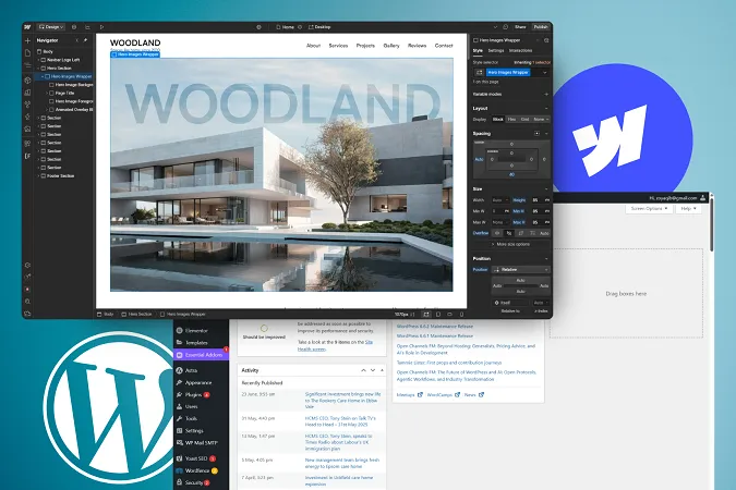
I recently deep-dived into 50 AI landing pages from some of the most recognized names in the space, from tools like Grammarly, Notion AI, and Jasper, to platforms like RunwayML, Synthesia, and TensorFlow.
These weren’t random picks. They’re some of the most recognized names in the space: brands leading the AI conversation and getting real user traction. I chose a mix of consumer-facing tools, developer platforms, and everything in between. From writing and productivity apps to design tools, voice and video generators, career platforms, and foundational AI infrastructure.
While the visuals were generally great (as expected), what really stood out for me were the patterns: the design decisions and content choices that showed up again and again across the best-performing sites.
This post is a breakdown of those lessons. Let’s get into it.
P.S. Want to see the full list of 50 AI brands I analyzed and explore their landing pages as editable Figma files? Grab them here to learn, practice, or just get inspired.
Lesson 1: Don’t make people guess
If there's one thing every top-performing AI landing page gets right, it's this: they make it crystal clear what the product does, who it's for, and why it matters.
This sounds obvious, but it’s surprisingly rare. A lot of AI websites still lean into dramatic, abstract headlines like "Redefining the future of work" or "Built for the next era of intelligence." It might sound bold in a pitch deck, but in real life, it forces visitors to scroll and decode what the product actually is.
The best sites skip that entirely. Clay is my favorite example of this. The headline tells you it’s a CRM, and not just any CRM—one that stays updated automatically using AI. You don’t need to scroll or piece things together. The value is immediate and the positioning is sharp.
Even Cursor, a developer tool, gets this right. It’s an AI-first code editor built for engineers. That’s a niche product, but the messaging is clear, and it doesn’t waste time trying to be clever. You land on the page and know within seconds if it’s relevant to you.
Lesson 2: Leave the innovation to the product, not the landing page
When you're designing a landing page for a cutting edge AI product, I’m sure it’s tempting to want to shake things up. Maybe the layout scrolls sideways. Maybe the pricing table sits in the hero section. Or the CTA lives inside a dropdown menu.
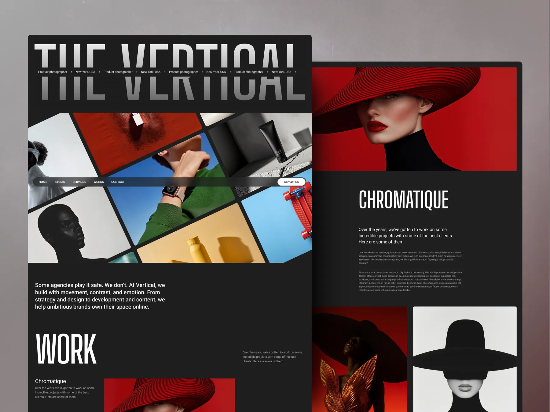
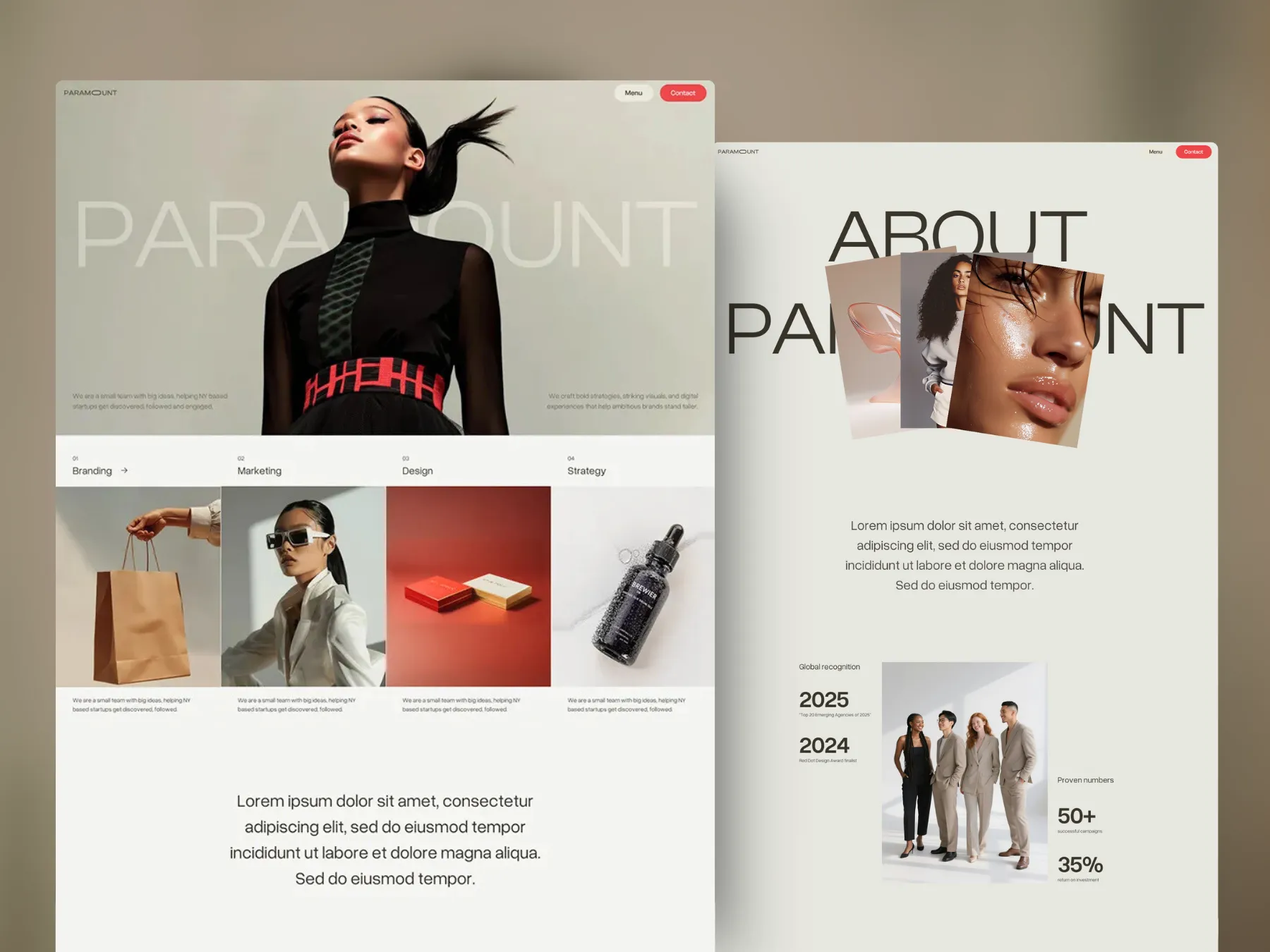
But after reviewing 50 AI websites, one thing became clear: the best ones follow a layout flow that’s extremely predictable…maybe even boringly familiar. But I learnt that that’s a good thing.
Most of these pages follow the same rhythm: You land on a clear, focused hero section. Then, almost immediately, you see trust signals (logos, press features, or testimonials). That’s followed by a quick value breakdown, a product visual, feature highlights, and a repeated CTA. Sometimes pricing shows up near the end. Sometimes it doesn’t.
This structure shows up again and again because it works. It mirrors how people process information when they’re evaluating something new. First comes understanding. Then trust. Then action. From Bubble to Grammarly to Jasper and more, nearly every high-performing site I reviewed follows this exact pattern because it’s proven to convert. It’s not a lack of creativity. It’s just good UX.
The same goes for animations, by the way. Motion in websites is all the rage these days to make the website feel more like an “experience”. The intent is good. The execution? Not always. The best AI sites take a different route. They use motion sparingly and strategically, to guide attention, emphasize key moments, or make the interface feel smooth and responsive. Nothing feels like it’s there just to “woo” you.
Relume's website is a great example. handles this well too. It uses just enough motion to make the experience feel dynamic—things appear and respond as you scroll—but it’s all tightly controlled. Clean fades, slide-ins, and hover previews give the site energy without overwhelming the message.
Surfer SEO also handles it well with subtle scroll-based transitions, light hover effects, and smooth tab interactions all feel purposeful. The animations add polish, but never compete with the content. The focus stays on the product, where it should be.
In both cases, motion works in service of the user. It adds clarity, rhythm, and focus, not chaos. Your AI product probably already has enough wow-factor. The website doesn’t need to outshine it.
Lesson 3: You shouldn't need a “Why Us” section to prove why you
It’s 2025. People are over the “Why us”, “Our mission” and “Our values” sections on websites.
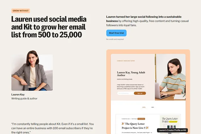
When they see these headings, they know exactly what’s coming: vague statements about being innovative, caring about customers, or building with passion. They know it’s fluff. They know it’s happy talk. And they skip right past it. Also, let’s be honest. Has a “Why Us”, “Our Mission” or “Our Values.” section ever told you anything real or useful about a brand? The best AI websites don’t waste time there. Instead, they show real proof usually in a combination of:
Logos of companies using the product.
Direct testimonials with names and faces.
Actual numbers—users, time saved, output created.
Bite-sized or even full case studies of real customers.
This kind of trust-building doesn’t just add credibility. It removes doubt. It shows potential users that they’re not alone, and that this tool already works for others like them. Sites like Jasper, Murf, Salt and Scale all do a phenomenal job at this and are some of my go-to examples.
Lesson 4: Make it effortless to get started with the product
If someone lands on your site and wants to try the product, don’t make them hunt for the next step. It sounds obvious, but it’s where a lot of new sites still drop the ball. Missable CTAs. Long forms. Gated demos that require booking a call first. You can feel the friction piling up.
The best AI sites make this incredibly easy. Most of them feature a single, focused call to action (often right in the hero section) and repeat it just enough times throughout the page to keep it top of mind. Even if the product is complex, they offer some form of low-effort entry point. That could be a “Try it now” button, a sample experience, or a short, ungated walkthrough. The goal is to give people a taste before asking them to commit.
Suno does a great job at this. You can enter your prompt for an AI-generated song as soon as you land on their home page. While it does require you to create an account before getting started (nearly all platforms do), it feels intentional and not obstructive. It’s likely a way to personalize the experience and capture the lead, not create unnecessary hoops to jump through.
In a space where everyone is promising magic, removing the barriers to experience it is what makes the product feel real.
Lesson 5: Match the design to the user, not just the tool
One of the most noticeable divides in the 50 websites I reviewed was how differently developer-focused AI tools and consumer-facing AI apps are designed. Same space, same tech, completely different approach.
Developer tools tend to lean dark, technical, and efficient. You’ll see terminal-style UIs, compact text, and minimal color palettes. The copy assumes you’re here for performance and integration—not a grand pitch. Think Tabnine or LangChain. Their designs don’t try to explain what AI is or how it works. They’re focused on performance, integration, and flexibility. They’re built to reassure developers that this tool will plug in, not slow down.
On the flip side, tools like Rytr or Fliki—which target creators and marketers—go for a much more approachable feel. Brighter colors, friendly CTAs, and visuals that explain the output in seconds. You don’t need to understand how the tech works. You just need to know what it can do for you. Look at Rytr or Fliki. They’re approachable. The copy is conversational. The visuals are playful and demo-heavy. You don’t need to understand AI; you just need to want better content or videos, fast.
It’s all about speaking the right language. The design language. If your product is for developers, speak to developers. If it’s for creators, reflect that in the visuals, tone, and flow. Design decisions should be audience-driven, not trend-driven.
TL;DR – Key Takeaways
If you're designing a landing page for an AI product, or honestly any product with ambition, here’s what the best are doing right:
Clarity wins. Say exactly what the product does, who it's for, and why it matters right in the hero section.
Familiar beats flashy. Stick to a structure that works. People expect things in a certain order for a reason.
Real proof > generic praise. Skip the “Why us” fluff and go ewith logos, testimonials, numbers, and real case studies that back you up.
Make trying the product frictionless. No one wants to book a call to see if it works. Show them now.
Visuals over words. Show the product in action. Demo it. Animate it. Let people feel it without reading a manual.
Design for your user, not just the tech. A dev tool and a content app shouldn’t look or sound the same.
Use motion with intention. Don’t distract. Use animation to guide, clarify, and add polish, not noise.
Bonus: Free Figma file with 50 AI landing page designs
If you’re a designer, founder, or marketer working in AI, this is for you.
I’ve put together a free Figma file with 50 landing pages from leading AI brands—organized, editable, and perfect for learning, remixing, or using as inspo for your next project.
Over 300 businesses have used my templates to launch their websites faster and look more professional online. Go live in half the time and at a fraction of the cost of custom development, with one of my professionally designed and fully customizable website templates.


.gif)
.webp)

.webp)